This blog post explores how to expand a drone-based pipeline for crop analysis....
From Drone Images to Insights
A Blog Post
Using Neural Networks for Canopy Coverage Detection and Measurement
This blog explores the development of a complete workflow – from drone images to accurate canopy coverage – using accessible tools and AI – driven techniques.
Introduction
Accurately measuring canopy coverage is a cornerstone of plant science research. Whether you’re assessing crop health, growth stages, or stress responses, this information is crucial. Traditional approaches like RGB-thresholding have served the community well but struggle under challenging conditions. For example, in areas with deep shadows or bright sunlight patches, RGB-thresholding might incorrectly classify soil or overexposed regions as canopy, or vice versa: parts of the canopy as soil. In contrast, the CNN model reliably distinguishes canopy pixels from non-canopy ones with an accuracy of > 95 %.
To address these challenges, I developed a pipeline combining drone imagery and deep learning. Powered by a convolutional neural network (CNN), the pipeline ensures high accuracy, even in less-than-ideal scenarios. Beyond its robust performance, it’s designed to be accessible to plant scientists without extensive programming expertise.
Who Should Use This Guide?
This pipeline is ideal for crop scientists, agronomists, and other plant researchers who work with aerial imagery or top-down hand held camera images, but don’t necessarily have a background in computer science. Its modular design means you can apply it not just to canopy analysis but also to related problems, such as canopy temperature measurement or soil artifact removal in images.
Overview of the Pipeline
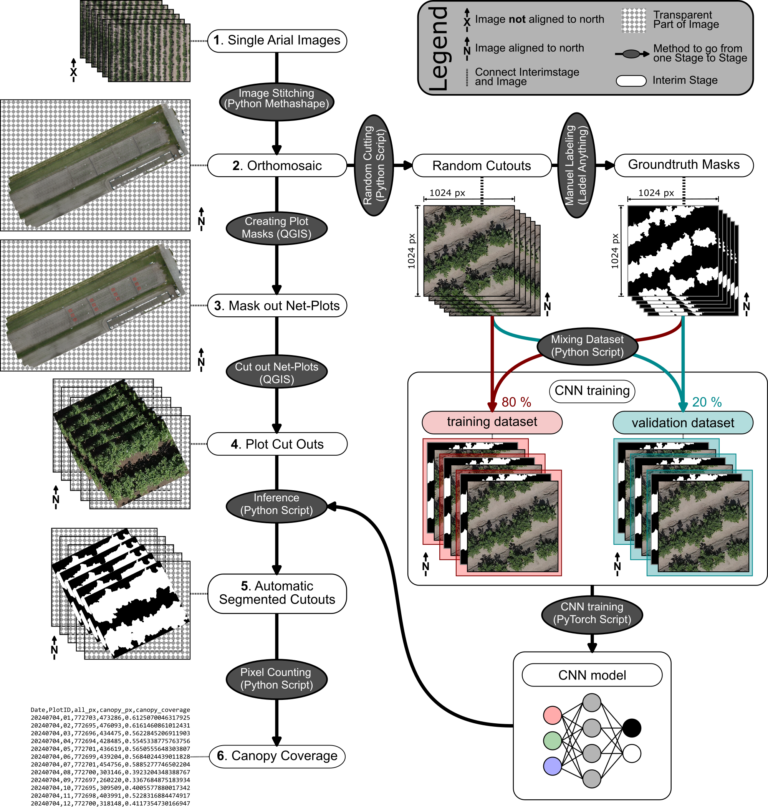
The pipeline processes drone images into actionable insights, specifically canopy coverage percentages. It’s structured as a semi-automated workflow where steps requiring human input, like masking plots, are minimized. The workflow starts with capturing drone images (step 1), followed by stitching them into a high-resolution orthomosaic (step 2). These orthomosaics are used to create net-plot masks (step 3), which are then cut into smaller regions of interest (step 4). A pre-trained CNN processes these cutouts to identify canopy pixels (step 5), and a final script calculates the canopy coverage percentage for each plot (step 6).
Step-by-Step Breakdown
Capturing Drone Images (Step 1)
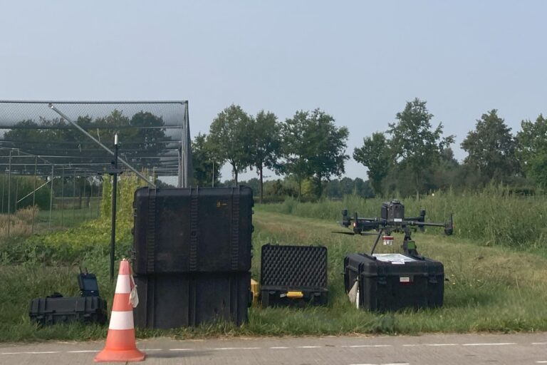
The process begins with flying a drone (e.g. DJI Matrice 350 RTK) equipped with an RGB camera over the field of interest. The drone captures single, georeferenced images of the study area. The high precision of RTK ensures that the images are well-aligned with real-world coordinates, which is essential for creating accurate orthomosaics. A manual georeferencing of the images is in theory also possible, but was not tested.
Creating an Orthomosaic (Step 2)
Once the drone images are collected, they are stitched together into a seamless, georeferenced orthomosaic using programs like Metashape or OpenDroneMap. Both softwares excel at processing large datasets, and there Python API allows for automation of batch processes. The result is a high-resolution map that combines all individual images into a single, continuous dataset, ready for analysis.
Note, that if you already have top-down images that capture the entire plot or region of interest in a single frame, you can streamline the process by skipping the orthomosaic creation and Plot Masking (Step 2, 3 and 4) step entirely. Instead of stitching multiple images together, you can directly crop the image to isolate your specific region of interest. This simplifies the workflow and saves time, especially for smaller plots whereyou can cover an entire plot with a hand held camera. This approach makes the pipeline even more accessible while maintaining its core functionality.
Masking Experimental Plots (Step 3)
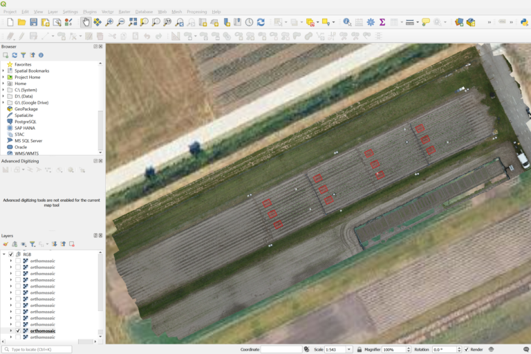
Using QGIS, net-plot masks where created to outline the experimental plots of interest. These masks are critical for isolating specific regions within the orthomosaic where canopy coverage will be measured.
Generating Plot Cutouts (Step 4)
With the net-plot masks defined, the next step is to cut out the corresponding regions from the orthomosaic. This process in QGIS produces smaller images, or “cutouts,” for each plot, making it easier to process them individually. These cutouts are the input for the CNN model in the next step.
Inference – Applying the CNN (Step 5)
The cutouts are fed into the CNN model, which segments them into binary masks, classifying each pixel as either “canopy” or “non-canopy”. This segmentation is done using a pre-trained UNet-based model built with PyTorch. The model’s high accuracy—demonstrated by a Dice score of ~0.97—ensures reliable results even under difficult lighting conditions.
Calculating Canopy Coverage (Step 6)
Finally, a Python script calculates the canopy coverage percentage for each cutout. By simply comparing the number of canopy pixels (white) to the total pixels in the mask image (generated in the previous step), it provides an accurate measurement of canopy coverage.
Training Your Own CNN Model
While the pre-trained model works well for some cases, you may need to train your own model for specific applications. Here’s how I did it:
The CNN model is based on a UNet architecture I implemented in PyTorch. To train it, I first prepared a dataset by generating random cutouts from orthomosaics (from Step 2). These cutouts were manually labeled using the tool AnyLabeling. For this project, I labeled 150 images in two days, aided by model-assisted features base on Meta’s “Segment Anything”-model that sped up the process.
The dataset was then split into training and validation sets in an 80/20 ratio. This split ensures that the model has enough data to learn patterns (training) while being tested on unseen data to evaluate its performance (validation). To train the CNN on a CPU-only system was a deliberate choice to also make the pipeline accessible to those without access to high-end GPUs.
The model’s performance was evaluated using the Dice score, a metric that measures how closely the predicted segmentation matches the actual labels. With a Dice score of ~0.97, the model achieved near-perfect segmentation.
Real-World Applications
This pipeline is versatile and has applications beyond canopy coverage calculation. For instance:
- Thermal imaging: Measure canopy temperature to assess plant stress.
- Digital elevation maps (DEMs): Estimate canopy height from RGB images.
- Soil masking: Eliminate soil artifacts e.g. in plant density measurements.
Future Directions
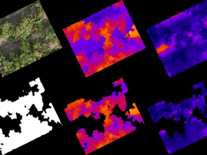
Future enhancements include integrating thermal imaging and DEMs for more detailed trait determination.
Conclusion
This pipeline simplifies canopy analysis for plant scientists, providing a robust and accessible tool for research. If you’re interested in using it or adapting it for your needs, I’d love to hear from you. The source code will be available soon, but feel free to contact me for pre-release access or collaboration opportunities.
Images/Videos from the Pipeline
Model (Mata AI Segment Anything) assisted labeling in AnyLabeling (1x speed)
Classification Examples from the CNN-model
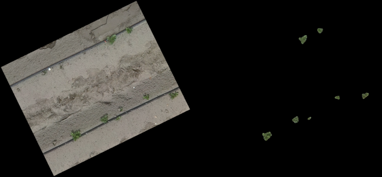
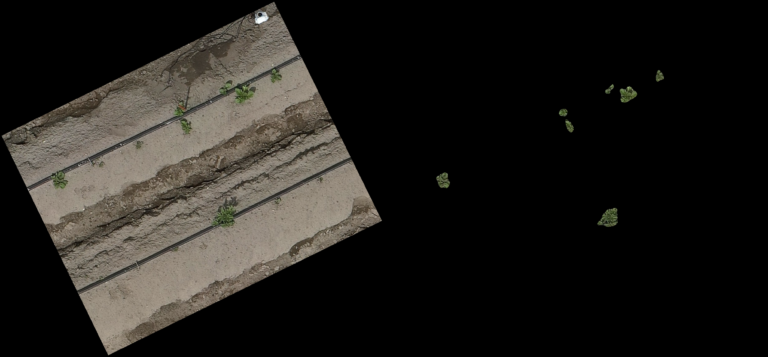
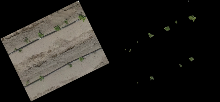
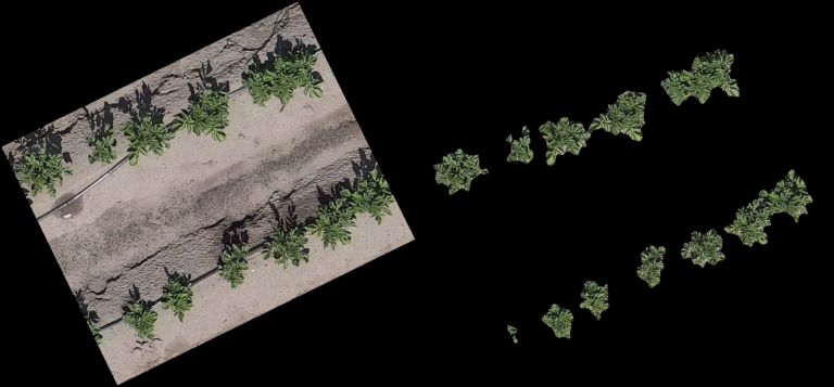
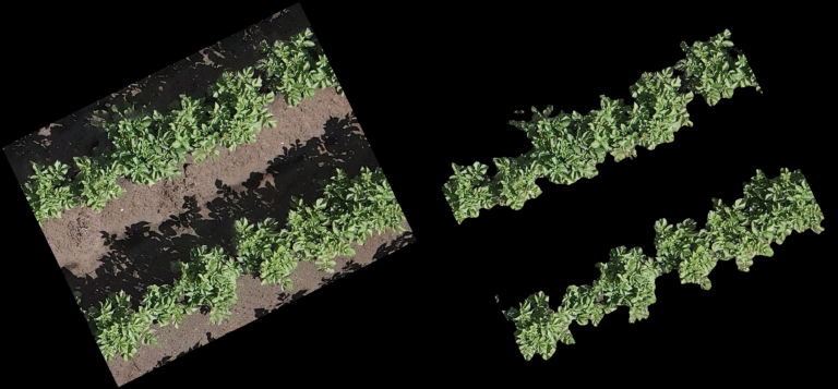
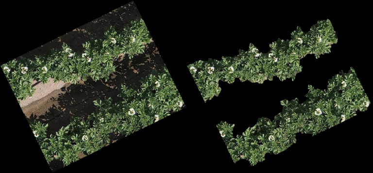
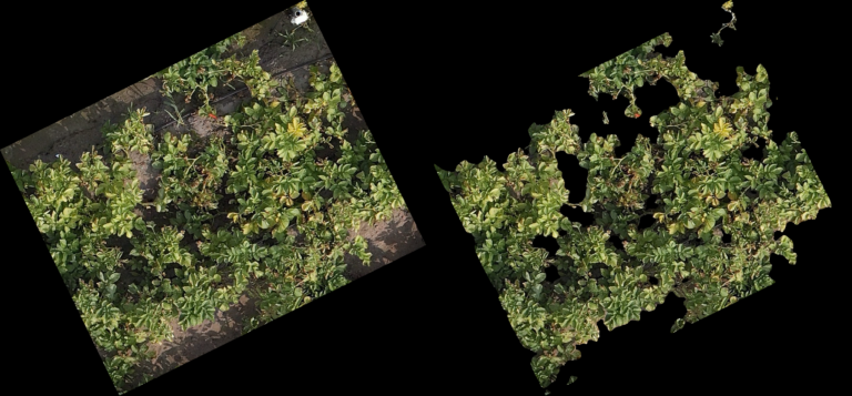
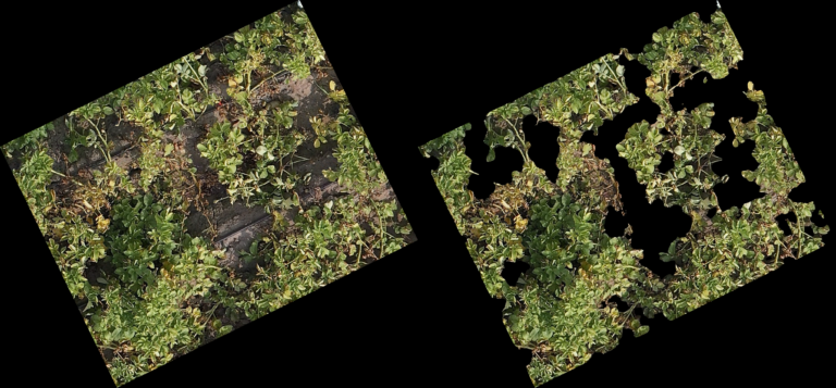
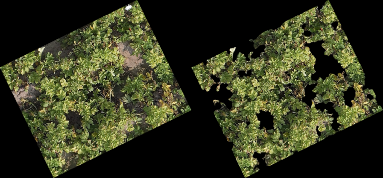
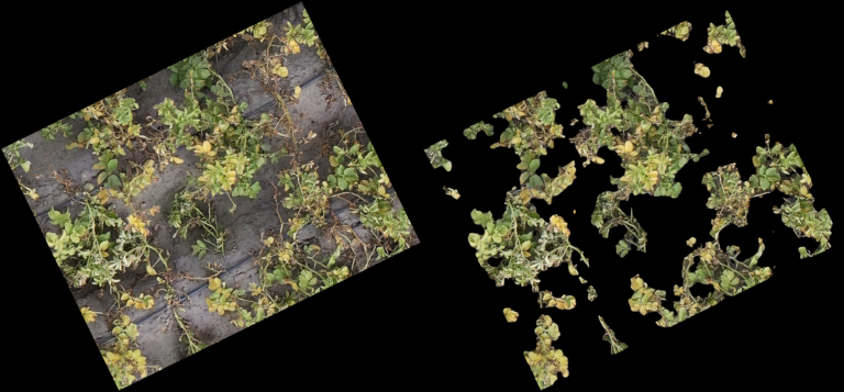
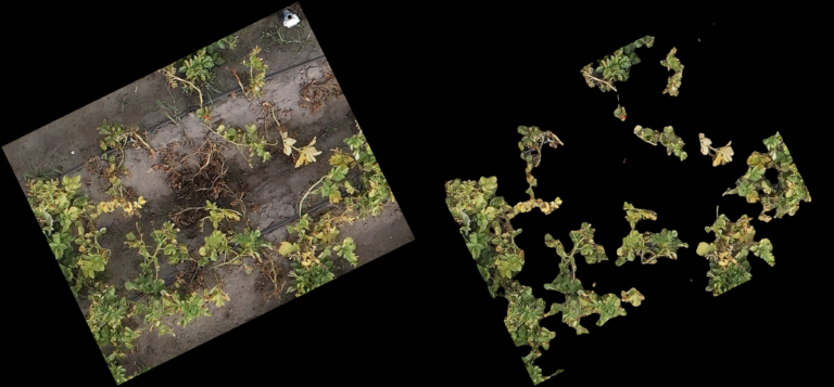
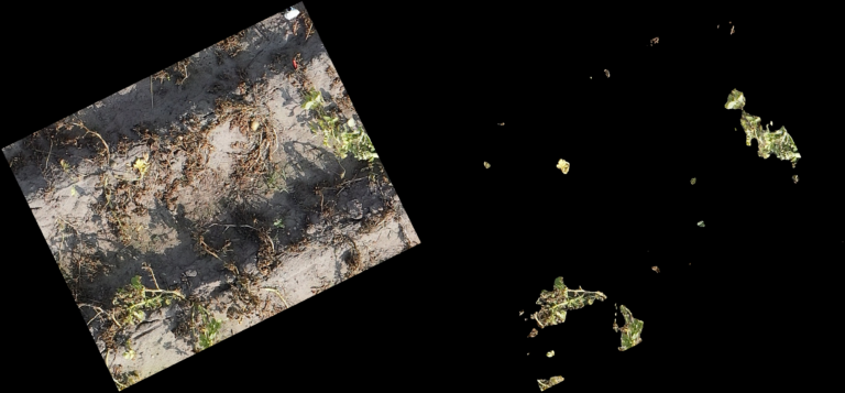
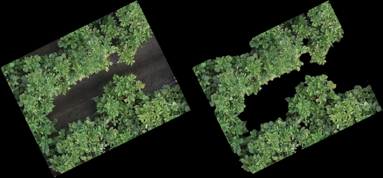
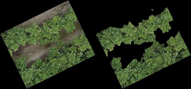
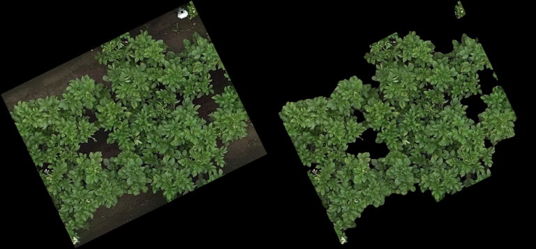
The pictures below show on the left the cutout from the orthomosaic (from Step 4) and on the right the same cutout, after the CNN generated a prediction mask and the non-canopy part of the prediction mask was cut away from the original cut out. In every row (every 3 pictures) you can see different lighting conditions and/or grow stages to judge how well the model handles varying conditions.
Note:
- The model even handles parts of the potatoes in dark shadows well
- From dying plants, only the still alive parts are detected
- Artificial objects (drip-irrigation tubes, shite sensor enclosure, …) are handled correct and confidently by the model
Read Part two of this Post:
Other Posts from all Categories
Why You Should Go Abroad in Your Studies
I thought I spoke English until a bus driver in Cork threw me...
PhenoSelect: Training a Neural Network Because I Refuse to Click on 100,000 Leaves
An introduction to PhenoSelect, an open-source deep learning pipeline designed to automate leaf...
How to Image a Whole Apple
A deep dive into the process of building a custom hardware and software...
Beyond the Naked Eye OR Why More Data Isn’t Always Better
An exploration into how hyperspectral imaging and machine learning can be used to...

